Harley Davidson new vs old logo
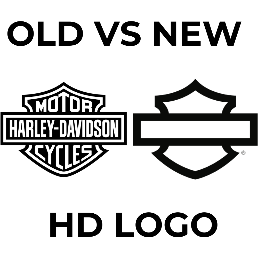
The Harley-Davidson logo has remained remarkably consistent over the years, with only subtle updates. Here’s a comparison of the old and new logos:

Old Harley-Davidson Logo
- Classic Shield Design: The original logo, often referred to as the “Bar & Shield,” was first introduced in 1910. It features a shield shape with the words "Harley-Davidson Motor Cycles" prominently displayed.
- Bold Typeface: The original logo used bold, all-caps text, which emphasized strength and reliability—qualities Harley-Davidson wanted to associate with its motorcycles.
- Traditional Colors: The logo typically used black and orange, colors that became synonymous with Harley’s brand and remain iconic to this day.

New Harley-Davidson Logo
- Modernized Variants: In recent years, Harley-Davidson has created updated versions of the Bar & Shield logo. These include sleeker, more minimal designs, sometimes omitting "Motor Cycles" and simplifying the overall look.
- Monochrome and Simplified Versions: Modern logos often appear in monochrome black or white and sometimes appear without the traditional shield shape. These versions align with more contemporary branding trends and give Harley-Davidson flexibility in digital and merchandise applications.
- Consistent Brand Identity: While there are simplified or modern versions, the core Bar & Shield remains widely used, staying true to Harley’s roots while still evolving for new audiences.
Overall, Harley-Davidson’s logo updates have respected its classic look, while the brand has introduced subtle tweaks to stay current and adaptable to modern design trends.
The logo’s evolution mirrors Harley’s effort to stay relevant while honoring its heritage.

Rémi
Founder of Kafein Kustoms, Rémi is a passionate motorcycle enthusiast and the founder of Kafein Kustoms. With years of experience in customization, he specializes in Clubstyle builds and premium parts, blending performance and style to help riders create their dream bikes.

